
Introduction
Website elements like headings, paragraphs, tables are defined by Html document and they are styled by CSS. By style, I mean colour, width, height, margin, padding, border, font, animations, and many more details. Basically, you can design anything comes to your mind but it is usually time-consuming and might not be beautiful. Luckily we have CSS frameworks like Bootstrap, Base, Pure which are designed by experts to be stylish and responsive on different size monitors. Bootstrap is well self-contained that you can design a website with only a little bit of CSS coding.
Goal
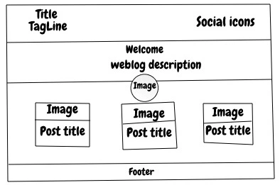
I want to create a lightweight homepage of a weblog with HTML, Bootstrap and a bit of custom CSS. No javascript, no database, no WordPress is used. It should be a lightweight and fast static website. The sketch is shown below and some animations will be added:
Tools
- Bootstrap for styling
- Text editor like Visual Studio Code
- Browser like Chrome, Firefox, … to see the page
Files
I created a folder with the below structure
weblog
|_______ images
|_______ icons
|_______ css
|      |____ bootstrap.min.css
|      |____ site.css
|__ index.html
folder images and icons contain images and icons, folder css has the Bootstrap minified file which is in the bootstrap package and site.css which is my custom CSS file.
Method
We put elements in index.html from top to bottom and use below Bootstrap classes
- Container: controls the width of children
- Row and Col: create responsive columns
- Flex: controls the way children spread in a container
- Jumbotron: create a banner
- Card: create a bordered image and caption
- Text: set colour, alignment, weight, style of text
- Margin:
my-*,mx-*,mt-*, … (where * is 1,2,..,5) * Padding:py-*,px-*, …
Results
Before going into details, see live demo of the result (not bad ha?). You can download it from GitHub.
Code
The index.html is like below
<html>

<head>
    <meta name="description" content="Free Web tutorials">
    <meta name="keywords" content="HTML,CSS,C#,C++">
    <meta name="author" content="John Smith">
    <link rel="stylesheet" href="css/bootstrap.min.css">
    <link rel="stylesheet" href="css/site.css">
</head>

<body>
    ...
</body>
</html>
The <head> section is for definitions and <body> section is what we see in the browser. <Meta> tags contain information about the website that helps search engines to know it better. The CSS files are reference via <link> tag. Now we can use Bootstrap classes in the body.
<body>
    <!-- title and social -->
    <div class="container">
        <div class="row">
            <div class="col-md "> ... </div>
            <div class="col-md d-flex justify-content-end my-auto"> ... </div>
        </div>
    </div>
    <!-- Banner -->
    <div class="jumbotron-fluid py-5 bg-dark text-white">...</div>
    <!-- Person Picture -->
    <div class="d-flex justify-content-center mb-2 mt-n5">...</div>
    <!-- Posts Cards -->
    <div class="container d-flex flex-wrap justify-content-around">
        <div class="card shadow m-2 my-card">...</div>
        <div class="card shadow m-2 my-card">...</div>
        <div class="card shadow m-2 my-card">...</div>
    </div>
    <footer class="py-4 bg-dark text-white-50">...</footer>
</body>
The first <div> is to create a row with two equal columns: left is title and tagline right is social icons. The next one is Jumbotron (or banner). Then I put the person picture in a flex class. After that, a container flex class is placed to hold the posts cards. The last one is the footer.
Now let’s check each section one by one. First title and social icons:
<div class="container">
   <div class="row">
        <div class="col-md ">
            <h6 class="text-center text-md-left">Website Title</h6>
            <h6 class="text-center text-md-left">An Amazing Inspiring Unique Tag Line</h6>
        </div>
        <div class="col-md d-flex justify-content-end my-auto">
            <a class="mr-1" href="#" target="_blank" rel="noopener noreferrer">
                <img class="icon icon-md" src="icons/github.svg" />
            </a>
        </div>
    </div>
</div>
The container class is used to make sure everything is visible on desktop, tablet, and mobile. It has one row and two columns. col-md (medium) means, in fact, the row is two columns in tablet and desktop. On mobile, it will be just one column made from all columns stacked on each other. I used heading 6 for the title and tag line. There is a trick here about text alignment. text-center sets texts centered on all devices, but immediately after we have text-md-left which changes that behavior to left-aligned on tablet and bigger screens. The next column contains the social icons which are put at the right-hand side using Flex. icon and icon-md are my custom CSS I explain at the end.
The banner is:
<div class="jumbotron-fluid py-5 bg-dark text-white">
    <h1 class="display-4 text-center">Hello, world!</h1>
    <p class="lead text-center">This is a simple hero unit, a
        simple jumbotron-style component for calling
        extra attention to featured content or information.
    </p>
</div>
jumbotron-fluid creates a strip from left to right on the page.
The weblog author picture is placed below:
<div class="d-flex justify-content-center mb-2 mt-n5">
    <img src="images/person.jpg" class="shadow rounded-circle" />
</div>
Shadow class adds shadow and rounded-circle makes the picture a circle. The Flex div put the picture horizontally centre. To create an overlay of the picture on jumbotron, top margin is set to -5 unit, mt-n5. If we look back at jumbotron we have a padding of 5 units in the y-direction, py-5. So Picture doesn’t cover jumbotron text.
The cards (posts) are:
<div class="container d-flex flex-wrap justify-content-around">
    <div class="card shadow m-2 my-card">
        <div class="my-card-image-container">
            <a href="#">
                <img class="card-img-top my-card-image" src="images/turned-on-pendant-lamp.jpg" style="width:100%">
            </a>
        </div>
        <div class="card-body">
            <h4 class="card-title">Post 1 What operating system is most secure</h4>
		<p class="font-italic text-secondary mb-1"> 15 Feb 2020 </p>
                <p class="card-text">Some random text are put here like box cup book ship clock tv fruit and so on ...</p>
                <a href="#" class="btn btn-link">Read ...</a>
        </div>
    </div>
...
</div>
We have a container class here to have the cards (post titles) inside. Class Flex is used to wrap cards when the screen is small. The card has to parts image and body. I wrapped the image part in a container as I wanted to give it a zoom animation when hovered. Card body is divided into two sections card title and card text which is self-explanatory. A read more button is added for navigation to the post page. I will write another article on how to create a post page.
And finally, the footer is:
<footer class="py-4 bg-dark text-white-50">
    <div class="container text-center">
        <small>Copyright © Your Website</small>
    </div>
</footer>
It has a dark background and white text. The texts are put in a container to make sure do not exceed screen limits.
My custom CSS, site.css, are:
.icon{
    transition: transform 0.2s ease-out;
}

.icon:hover {
    transform : scale(1.1);
}

.icon-md{
     height : 24px;
     width: 24px;
}

.my-card {
    width: 300px;
}

.my-card-image-container{
    overflow: hidden;
}
.my-card-image {
    transition: filter 1.5s ease, transform 1.5s ease;
}
.my-card-image:hover {
    filter: grayscale(100%) sepia(100%);
    transform: scale(1.2);
}
Icon class is to create a zoom-in animation when the icon hovered. icon-md class is to give icons a medium size.
my-card-image class is to add zoom-in and colour-change animations to card images. my-card-image-container is used to make sure when the image hovered and scaled it doesn’t overlay others.
Download Size
Ok, let’s see if it is worth it. I loaded the index.html in Chrome and got below results
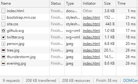
208 KB is downloaded of which 152 KB is Bootstrap. The average webpage size currently is about 4MB (see this article). So we are way lower than that. On average each new card adds 16KB = 15 KB image (300px width) + 1KB content which means 10 more cards only adds 160 KB to this homepage. Of course, after that, a second page can be filled with cards via pagination.
The Bootstrap file contains many classes that we used a small portion of. We can remove the unused classes and free more downloading data. Probably I will do that when I completed the whole website.