Introduction
Blazor currently is a very new open-source framework that helps C# developers create interactive web applications without javascript. There are several editions of Blazor like Server-side rendering and client-side rendering (WebAssembly). A Blazor app is made of razor components. Each one is a reusable user-interface that is designed to be very similar to a C# class. Knowing how to create components in one edition means you can do the same in others.
Goal
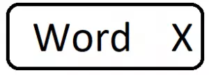
In this post, I want to create a simple word-block which is a rectangle that contains a word with an X button at its right side similar to the picture below

They can be used as keywords or tags that users can add or delete. Here, I want the word-block to have the specifications below:
- On mouse hover X, it’s background-colour changes (CSS)
- On mouse button down on X, the block shrinks with animation (Blazor + CSS)
- On mouse button released on X, it is removed from a page (Blazor)
- The page is notified by an event-call-back that the user removed the component (Blazor)
Results
See the full code on GitHub and the demo app on Heroku. The app can take several seconds to boot up.
Tools
I am using Visual Studio 2019 v16.4. It provides Blazor server template out of the box but Blazor WebAssembly template currently is not there. The preview version can be added (see instruction).
Project files
First, you need to add the empty files below to the Blazor project:
1- WordBlock.razor: the component contains C# and Html code. It can be added by right-clicking in solution explorer -> Add new item -> Razor Component. It can be placed in an arbitrary folder.
2- wordblock.css: the CSS file for this component. I placed it in wwwroot/css/ folder. Add below line into the head tag of index.html in Blazor WebAssembly or _Host.cshtml in Blazor Server.
<link href="css/wordblock.css" rel="stylesheet" />
Solution
The outcome files are shown below. I explain them in the next section. WordBlock.razor Component file:
@if (isVisible)
{
    <div class="wordblock__container ">
        <span
              class="wordblock__word @wordClassModifier"
              >@Word</span>
        <span class="wordblock__x"
              @onmousedown='(_=>OnMouseDown())'
              @onmouseup="(_=> OnMouseUp())"
              @onmouseout="(_=>OnMouseOut())"
              >✕</span>
    </div>
}

@code {

    private bool isVisible = true;
    private string wordClassModifier = "";

    [Parameter]
    public string Word { get; set; }

    [Parameter]
    public EventCallback<string> OnClose { get; set; }

    private void OnMouseDown()
    {
        wordClassModifier = "wordblock__word-shrinked";
    }

    private void OnMouseUp()
    {
        isVisible = false; OnClose.InvokeAsync(Word);
    }

    private void OnMouseOut()
    {
        wordClassModifier = "";
    }
}
wordblock.css file
.wordblock__container {
    display: inline-flex;
}

.wordblock__word {
    flex: 1;
    color: white;
    background-color: darkblue;
    padding-left: 2px;
    padding-right: 2px;
    border-radius: 3px 0px 0px 3px;
}

.wordblock__word-shrinked {
    transform-origin: right;
    animation: shrinking 0.1s ease-out forwards;
}

@keyframes shrinking {
    0% {
        transform: scaleX(1);
    }

    100% {
        transform: scaleX(0.0);
    }
}

.wordblock__x {
    width: 1.2em;
    background-color: darkblue;
    color: white;
    cursor: pointer;
    text-align: center;
    border-radius: 0px 3px 3px 0px;
    user-select: none;
}

    .wordblock__x:hover {
        background-color: gray;
    }
Solution Explained
A Blazor component has two sections: rendred section and code section. The Rendered section is where HTML elements are shown with C# logic. The code section is like a class containing C# members and methods.
@* Rendered Section : HTML + C# *@

@ code{

// C# members, methods, events

}
In the Rendered section, I wrapped HTML elements in an if block controlled by isVisible variable. If false, the rendered section is not seen in DOM.
@if (isVisible)
{
    @* Html + C# elements *@
}
Then I put the Html elements: a container, a span for the word, and a span for X button. Elements contain CSS classes to style them and events which are handled by C#.
isVisible variable is changed to false if mouse button released on X. Moreover, I am informing the outside parent of the component that this component is disappearing by triggering OnClose() event. [parameter] means this property can be seen in the parent.
...
<span class="wordblock__x" @onmouseup='(_=>OnMouseUp())'
...
@code{
...
[Parameter]
public EventCallback<string> OnClose { get; set; }

private void OnMouseUp()
{
    isVisible = false;
    OnClose.InvokeAsync(Word);
} ...
The other property that is important to be set from outside is Word because of that, it is decorated with the attribute [parameter].
The CSS classes are defined in wordblock.css file. They are quite straightforward: a class for the container, a class for word span, and a class for X span. For the container, I used flex-box as it easy to fill. The class wordblock__x:hover takes over when pointer is on X button. This can be done with C# too but much cleaner and simpler when handled by CSS only.
For shrinking animation, I added a modifier class, wordblock__word-shrinked, for word span. So to activate it, we have to add it to word span classes in the Html code. But we only want to see the effect when the mouse button is down on X. That’s how C# in Html code comes handy.
...
<span class="wordblock__x" @onmousedown='(_=>OnMouseDown())'
...
@code{
...
private void OnMouseDown()
    {wordClassModifier = "wordblock__word-shrinked";}
...
}
And of course, we have to remove the class modifier when the pointer away
...
<span class="wordblock__x" @onmouseout='(_=>OnMouseOut())'
...
@code{
...
private void OnMouseOut() {wordClassModifier = "";}
...
}
Usage
Now we can use the component anywhere and many times in other components or pages of the project like below
<WordBlock Word="Apple" OnClose="(word => OnBlockClosed(word))" />

<p>@message</p>

@code{
    private string _message = "";

    private void OnBlockClosed(string word)
    {
        message += word + " closed!";
    }
}
