Goal
The goal is to create a high-quality chart that can be used for scientific journals. A Python script is written that:
- Reads different columns with different rows from a CSV file,
- The arrays can be scaled,
- Create an x-y chart with the data,
- The charts labels can be LaTeX equations,
- The chart details are modified: font, font size, colour, line style, markers, minor and major ticks and so forth.
LaTeX
The LaTeX equations need to be compiled, Matplotlib can compile them without LaTeX being installed on your machine. The format should be like
a_sample_label = r'$a + \frac{\theta} {s}$'
Do not miss r before the string.
You can also install LaTeX on your machine to ensure that you get the best quality equations in the charts.
On Ubuntu, install LaTeX via:
sudo apt-get install texlive-latex-extra texlive-fonts-recommended dvipng cm-super
Install Matplotlib
In a Linux terminal run the below code:
python3 -m pip install matplotlib
Install Numpy
Run the below command in a terminal
python3 -m pip install numpy
CSV sample
The content of the CSV file is
a,b,,c,d
0,0,,0.5,0.25
0.5,0.5,,1,1
1,1,,1.5,2.25
1.5,1.5,,,
2,2,,,
The numbers are shown cleaner in this table:
| a | b | c | d | |
|---|---|---|---|---|
| 0 | 0 | 0.5 | 0.25 | |
| 0.5 | 0.5 | 1 | 1 | |
| 1 | 1 | 1.5 | 2.25 | |
| 1.5 | 1.5 | |||
| 2 | 2 |
To have a real-life example, I designed an irregular table. It has 5 columns, a and b columns have 5 rows, the third column is empty and c and d have 3 rows.
Code
The final code with comments is here. It is run with Python 3.9.4.
import matplotlib.pyplot as plt
import matplotlib.cbook as cbook
import numpy as np
from matplotlib.ticker import (MultipleLocator, AutoMinorLocator)
import os

# current working directory
cwd = os.getcwd()

# Read columns a, b
with cbook.get_sample_data(cwd+'/data.csv') as file:
    ab = np.loadtxt(file, delimiter=',', skiprows=1, max_rows=5, usecols=[0,1])
# Read columns c, d
with cbook.get_sample_data(cwd+'/data.csv') as file:
    cd = np.loadtxt(file, delimiter=',', skiprows=1, max_rows=3, usecols=[3,4])

# Let's scale column b
b_scale = 1

a = ab[:,0]
b = ab[:,1]*b_scale

c = cd[:,0]
d = cd[:,1]

# Print size of Data
print(ab.size)
print(cd.size)

# Font setup
plt.rc('text', usetex = True) # True: system LaTeX, False: matplotlib LaTex
plt.rcParams["font.family"] = "serif" # serif, sans-serif, monospace, cursive, fantasy
small_font = 10
medium_font = 12
big_font = 14

plt.rc('font', size=small_font)
plt.rc('axes', titlesize=small_font)
plt.rc('axes', labelsize=medium_font)
plt.rc('xtick', labelsize=small_font)
plt.rc('ytick', labelsize=small_font)
plt.rc('legend', fontsize=small_font)
plt.rc('figure', titlesize=big_font)

# Plot
fig, ax = plt.subplots()
ax.plot(a, b, label='ab', linestyle='-', color='blue', linewidth=2)
ax.plot(c, d, label='cd', linestyle='none', marker="X", markersize=10,
         markeredgewidth=.5, markerfacecolor='orange', markeredgecolor='green' )

ax.legend()

ax.set_xlim([0,2])
ax.set_ylim([0.1,4])

# Put a major tick every 0.5 distance
ax.xaxis.set_major_locator(MultipleLocator(0.5))
ax.xaxis.set_major_formatter('{x:0.2f}')
# Divide a major step into 5 minor steps
ax.xaxis.set_minor_locator(AutoMinorLocator(5))
ax.grid()

plt.title('Graph', fontsize=big_font)
plt.xlabel('time', fontsize=medium_font)
plt.ylabel(r'$a + \frac{\theta} {s}$', fontsize=medium_font+0.5)
plt.yscale("linear") # You can use "log", "symlog", "logit"
plt.show()
Outcome
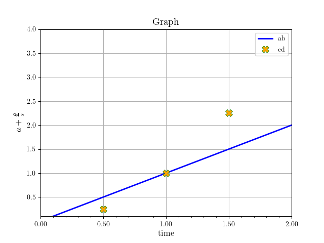
The figure below is made with the code above, using Matplotlib LaTeX:
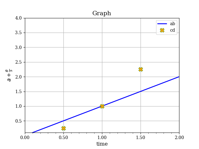
This one is made with the same code but using the LaTeX installed on Ubuntu: