
Goal
I want to write code to get a table of content (ToC) for each blog post automatically. It is created and shown on the right-hand side of the content of a post. Readers can click on the desired section and the browser automatically scrolls to that section. The ToC is hidden on small screens like smartphones. I style it to be nice and clean.
Result
At the time of writing this post, this post has a ToC on the right-hand side. But it is not visible on small screens like smartphones. So I added a video for whom it is not visible.
HTML
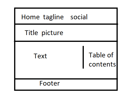
The HTML code of a post has different elements like top headers, titles, pictures, and so on. But we focus only on the content area to divide it into text (article) and ToC (nav) like the picture below
In the singl.html file of my Hugo website, I wrap my old content in a new div and add a new nav section for ToC as below
<div class="article-nav" id="article-nav-id">
    <article class="overlay-top">
        {{ .Content }}
    </article>
    <nav class="hide-on-mobile section-nav">
        <h3 class="ml-1">Table of contents</h3>
        {{ .TableOfContents }}
    </nav>
</div>
CSS
I only explain the important CSS parts. To hide the ToC on small screens, I add a media query
  @media screen and (max-width: 1024px) {
  .hide-on-mobile {
      display: none !important;
  }
}
To style container of article and nav, I use a grid so the left-hand side is the article and the right-hand side is the ToC.
@media only screen and (min-width: 1025px) {
  .article-nav {
    display: grid;
    grid-template-columns: 1fr 15em;
    max-width: 100em;
    width: 90%;
    margin: 0 auto;
  }
}
sticky position is very important to have a fixed in place ToC:
nav {
  position: sticky;
  top: 2rem;
  align-self: start;
}
When a ToC item is marked as active using JavaScript it will be like:
.section-nav li.active > a {
  color:purple;
  font-weight: 600;
}
The nav section (ToC) is styled like below
.section-nav {
  font-size: smaller;
  padding-left: 0;
  border-left: 2px solid #efefef;
}
The links of nav are formatted as below, transition settings make navigation smooth.
.section-nav a {
  text-decoration: none;
  display: block;
  padding: .125rem 0;
  color: #ccc;
  transition: all 50ms ease-in-out;
}
Some styling CSS for nav
.section-nav a:hover,
.section-nav a:focus {
  color: #666;
  font-weight: 600;
}

nav > ul, ol {
  list-style: none;
  margin: 1rem;
  padding: 0;
}
JavaScript
Add the below codes somewhere in single.html before the last {{\end}} line. It finds the current section on the screen, and assign class active to its corresponding nav item, and clears it when the section goes out of view.
<script>
	window.addEventListener('DOMContentLoaded', () => {
		const observerForTableOfContentActiveState = new IntersectionObserver(entries => {
			entries.forEach(entry => {
				const id = entry.target.getAttribute('id');

				if (entry.intersectionRatio > 0) {
					clearActiveStatesInTableOfContents();
					document.querySelector(`nav li a[href="#${id}"]`).parentElement.classList.add('active');
				}
			});
		});
		document.querySelectorAll('h1[id],h2[id],h3[id],h4[id]').forEach((section) => {
			observerForTableOfContentActiveState.observe(section);
		});

	});

	function clearActiveStatesInTableOfContents() {
		document.querySelectorAll('nav li').forEach((section) => {
			section.classList.remove('active');
		});
	}
</script>
References
I pulled this task off hugely due to codes and ideas had been put before in the below pages.
Mattias Geniar Bramus Van Damme
Latest Posts
Comments
1 comment
Rey
15-Jan-2023
Good explanation